Sunday, April 12, 2009

Another CD Cover

I know it's no excuse, but I haven't blogged in a while because I have been busy... really busy. Actually, between a full time day job, two businesses, a family, friends, and daily life, I am surprised I have time to eat and sleep, but somehow it all works itself out. I know a lot of people that do a lot of things, so I am by no means special, it's just a fact of life.

But that is not what I wanted to blog about. I really wanted to update you with another CD cover I did for Stacy, the dancer from Austin. I have plans to do a total of three or four of these covers, but I have only been able to work on two of them so far. The first was a copy of a Tupac cover for his "Best Of" album. Now I am copying a Lil' Kim cover. I like this one a lot. First of all, Stacy was a blast to work with and creating this image was a lot of fun. Let me know what you think.

This is the original Lil' Kim cover that was the inspiration for the copy below.


This is the mocked up version. Not exactly the same, but pretty close.

Sunday, March 22, 2009

What do your words say?

I am sure most of you know about word clouds or tag clouds by now. If not, they are representations of some body of text in the form of, well, a word cloud. It's hard to explain better than that, but essentially the word cloud is a bunch of words arranged in a cloud-like shape that show what words appear most often in some body of text. The larger the font of the specific word, the more often it appears in the text.

Why am I blogging about this you ask? Well, actually I follow a lot of people on Twitter. If you don't know what that is, check it out. I may blog about Twitter later, but for now let's focus on word clouds. So, the reason why I thought this would be a good blog post is because I saw one of my tweeps post a link to his word cloud and the name of the service he used to generate the word cloud. Now I have seen these types of services before, but this one is really easy to use and it gives you the ability to customize your cloud with a few simply clicks. The service is called Wordle. The great thing about this one is you can generate a word cloud of pretty much anything as long as you know the URL. Some services require the username and password of the account holder to do these types of things, but this one doesn't.

This is the word cloud from this blog (pwphotographer.blogspot.com).
I generated it yesterday using Wordle. I customized the layout to include
numerous colors, random angles, and a Roman-type font.

This is the word cloud from my sister's blog (lifeonlaurel.blogspot.com).
I generated it yesterday using Wordle. I customized the layout to include
four basic colors, straight angles, and a whimsical font.

So you can see from the images above that the word clouds can look quite different. And it only took me a few minutes to generate both of these word clouds. It's really a fun thing to do if you have a blog or follow someone regularly. Try it out and let me know what you think.

Saturday, March 7, 2009

Copycat CDs and they aren't from China


If I offended anyone by the title of this post... too bad. It's a fact that China is one of the worst offenders when it comes to piracy of any type. Although CD piracy isn't as common as it once was, that activity is simply being replaced by other forms of media including DVDs and Internet music. But I digress...

The point of this post is to show you one of the CD covers I imitated using a photo I took of Stacy a few weeks ago. I mentioned in my post about the shoot that I was going to mock up several CD covers for her since she is a dancer that specializes in break dancing and is really into hip hop and rap music. The first cover I copied was Tupac's Best of Tupac Part 1: Thug CD. You can the original and the mock up below.

Original CD cover courtesy of Amazon.com

Mocked up CD cover (as if you needed to be told).

For the mock up, I had Stacy pose in a similar way. Then I completed the look in Adobe Photoshop. I used color adjustments to get the gold tone. I then created several layers to add the advisory label. Finally, I created a gradient for the title bar and added the text. Overall, I think it looks pretty close to the original. I plan to mock up the other CD covers in the next few weeks and I will post those as well. Let me know what you think!

Saturday, February 28, 2009

Breakin' all the rules


Here, Stacy is in her traditional break dancing outfit.
She is part of Austin's Urban Transit crew. Don't let her petite
size fool you, she can bust a move with the best of them.

A week ago, I photographed Stacy, a local dancer. When I met her about a year ago, she was working her way through college teaching dancing to kids and waiting tables. Since that time, we have continued to stay in touch. She has always talked about her plans to go to Las Vegas to dance professionally. Well, now she is a college graduate from Texas State and she is getting ready to fulfill her dream. My part in that plan is simple. She needed some photos in various dancing poses as well as some headshots for her resume. The other week, we were finally able to coordinate a photo shoot in Austin. The two images you see here is only a small sample of what we did. Since Stacy is a trained dancer, she is well versed in all genres of dance. We took photos of her doing ballet, contemporary, break dancing, and 80's Flashdance style poses. In fact, Stacy is part of a dance crew in Austin called Urban Transit. If you haven't heard of them, check them out on YouTube. They are really good. The crew participates in competitions all over Texas.

But back to the photo shoot... Stacy feels much more comfortable being serious or even goofy in front of the camera than she does being sexy. But trust me, she can do the latter very well too. After taking several hundred pictures of Stacy in various dance outfits and poses, we transitioned to more sexy FHM or Maxim magazine style photos. Finally, we wrapped up the day by posing in the style of some of Stacy's favorite hip-hop artist's CD covers. I plan to Photoshop the copy onto the images to mock up the CD covers with Stacy on them instead of Tupac, 50 Cent, and Lil' Kim.


This pose is a copy of a Tupac CD cover from his album
Best of Tupac Part 1: Thug. Stacy posed in the style of three
different artists' CD covers including Tupac, 50 Cent, and Lil' Kim.

Stacy, I hope you had fun and I wish you the best in Vegas. If you make it as a dancer, drop me a line and let me know. I'd love to make it out there to see you. Of course, I will expect complimentary tickets and backstage passes! :)

Sunday, February 22, 2009

Up to the challenge

I was challenged by Jackie, a blogger and friend of mine, to post the 4th image from the 4th folder on my computer. It took me almost a week to do this because I most of last week out of town and I wasn't near my 24" iMac, which has all my images. So here goes...

It was getting late in the day when the flower girl decided she was
done rehearsing. You can see the tissue paper in her basket that
were representing the flower petals she would be laying down
the next day at the wedding. She is a cutie for sure, but just a little
overly dramatic, don't you think?

This picture is of Casey, the daughter of my wife's sister-in-law's sister-in-law and flower girl. Did you get all that? Well, anyway... it was taken on June 16, 2006 in Cary, North Carolina. I was the photographer for my sister-in-law's wedding and I was at the rehearsal when I captured this image. The participants at the rehearsal had been going through things for about 40 minutes when the flower girl decided she was done. She laid down in the middle of the imaginary aisle in a very dramatic way. As if she was telling her mom, who happened to be the wedding planner, that she didn't think all this practicing was really that much fun.

It is interesting to think about this image and where I was nearly three years ago with my photography. I had always been involved in photography to some degree throughout my life, but I only really began to try to make money at it when I entered the digital revolution. Actually, this wedding that I was in North Carolina to photograph was only my first "paying" job. I say that because I was paid by my sister-in-law even though I told her I would do it for free just to get the experience. I had only recently purchased my first Digital SLR, a Nikon D50, a few weeks earlier. That camera now is with my sister, who is loving it. You check out her blog and see the great images she is creating with the camera. I gave it to her as her Christmas gift last year and her Birthday gift this year (she doesn't know that second part yet, but she will when she reads this post :)

But now I have nearly three years of trying to make money as a photographer under my belt. Oh yeah, and a new camera. I bought a barely used Nikon D2x last year from a photographer in Florida, Tom Grissman, who was getting rid of his so that he could get the new D3. You see, even though I say I am trying to make money at photography, it isn't my full time job... yet. I work during the day and do photography and other creative work at night and on weekends. So far that is working for me, but if I felt I could really make it in photography, I would do it in a minute. Maybe one day...

To end this post, I must challenge four other people, in keeping with the theme. So here are my four picks:
  1. My sister, Megan (of course)
  2. My friend, Tyler
  3. My favorite baby and child photographer, Piper
  4. A player to be named later

Tuesday, February 17, 2009

Fashion for everyone


A few weeks ago I met Maddie, a college student, at a restaurant in Austin. At one point during the evening, we started talking about modeling. That discussion led to Maddie mentioning that she wanted to do some fashion modeling. Of course, I took the opportunity to mention that I was a photographer. And the rest, they say, is history.

So fast forward several days to last week. Maddie and two of her college friends met me at my studio. They brought their iPod nano full of music, some wine (for them, not me), and a great attitude. Her friends were there to help Maddie with posing ideas and they were fabulous. While I adjusted lights and made sure that Maddie was looking her best, her friends were instructing her on what pose to do next.


Maddie brought over three dresses and I used three backdrops to give us some different looks. We spent about two hours doing the shoot and took nearly 600 images. As you can see from the images, Maddie is very comfortable in front of the camera. Not to mention, she looks great! I think she definitely has a future in modeling.


For all of these images I used my Alien Bees studio strobes. I just recently purchased an Paul C. Buff foldable giant softbox and I used that as my key light. For the fill, I used some white foam core. And I placed a bare strobe with a 20 degree grid as my back light. I processed the images in Adobe Lightroom 2 and did some final clean up in Adobe Photoshop CS3.

Let me know what you think. Leave a comment on the blog. Thanks!

Sunday, February 8, 2009

Who needs high quality glass?

To the question "who needs high quality glass?" well... apparently, I do. You see, I bought a little plastic pinhole camera kit from the Houston Museum of Natural Science store several months ago, and I finally took it out on the streets of New Orleans to try it out during my last trip there. The pinhole camera simply snaps to together, which is easy enough. The hardest part is creating the pin hole. This is done by piercing a piece of aluminum foil. What's so hard about that you ask? Just keep reading. The great thing about the camera is that it uses standard 35mm film. The kit is made by 4M Kidz Labs and cost me about $12.00.

The instructions left a lot to be desired. Since I hadn't used a pinhole camera before, I was not clear on how long to hold the shutter open. The only point of reference the instructions gave me is "on a sunny day, an exposure of half a second will expose properly." The problem is I don't know what speed film they were using. I chose to use some 400 ISO film that my sister had in her fridge. I figured a little extra light sensitivity couldn't hurt.

The other tough thing about this particular pinhole camera is that to advance the film, you have to guess how many clicks to twist the knob. The instructions indicate a full rotation for the first few frames. After that, they say to turn the knob a few less clicks for every 6-8 frames. This is because as you wind more film onto the receiving knob, it takes fewer clicks to advance the film an entire frame. Unfortunately, that got me on several frames. There were many that I double exposed part of the frame because I didn't advance it enough.

So, how did the pictures turn out you ask? Well, not that great. Below are two of the best images that I made using the camera. The first picture is of a beer can I found in the grass on the banks of the Mississippi River.


This next picture is of a cat in a window of one of the many shotgun houses in the Garden District.


The exposure seems good, but the blurriness detracts from overall image. Reading the troubleshooting section of the instructions, it indicates that the smaller the hole, the more clear the image. I guess I made the hole too big this time. I will try again and see if I can improve my results. Check back for an update later.

Tuesday, February 3, 2009

A website is a lot of work

Over the last several weeks, I have been working extremely hard to launch a new website. The reason for the new website was two-fold. First, I created my own website originally using iWeb. While this served its purpose initially, I had outgrown what I could do with that program. Specifically, I wanted a more dynamic Flash-based website. Second, I had decided to rebrand my services to specialize in photography only. Previously, I had offered other services such as graphic design and video production too.

So, once I decided to go that route, I began considering the various options for my new website. My first thought was to learn Flash and design my website from the ground up. While that sounds great, I quickly learned that Flash isn't easy to learn. And I am not that well versed in web design. In fact, I know just enough HTML to get me in trouble. Other than that, I need WYSIWYG software to help make it possible for me to anything more. My second thought was to buy a Flash template from a website such as iwebtemplates.org. They offer prebuilt Flash templates that anyone can customize and publish. Alternatively, you can pay to have their web designers customize the template to your specifications for an additional fee. While the pricing of the templates were reasonable, around $70 for most templates; I was still unsure of my ability to customize the template to my liking. And the option of having their web designers do the work quickly added up to a lot of money.

After much deliberation, I chose a third alternative. I elected to buy a template from bludomain. They offer prebuilt Flash-based websites for creative professionals. The great thing is all of the customization can be done through a very user friendly web interface. Of course, you are limited to how much customization can be done versus unlimited options if you buy a template from a website like iwebtemplates.org. Despite that limitation, I was very happy with the flexibility the template offered and the whole process of customizing the site was easy. I actually purchased a template that was originally priced at $400, but at the time I bought it (January 2, 2009) they were offering it for only $100. I thought that was a pretty good deal.

It took me nearly a month to customize the website, but that was because I couldn't work on it every day. I spent a few days every week during the month of January until I had it almost done. But before I could officially launch the website, a potential client asked me for my website information. Instead of giving out my old one, I decided to go home that night and launch even though I had a few more things to finish. I figured I could make the final changes to my website after the launch. And I was right. Making changes to my site now is just as easy as it was before the site launched.

This is a screen capture from the home page of my website. It cycles through
various images from my portfolio while music is playing in the background.
The menu slides up from the bottom to access other pages of the website.

So, if you can't already tell from this post, I am very happy. I would recommend bludomain to anyone interested in a dynamic Flash-based website, especially if you are in the creative services industry. To check out my new website, go to www.pwphotographer.com. Post a comment and tell me what you think.

Tuesday, October 21, 2008

A Jolly Good Time!

This is a picture of two guards changing shifts on duty outside one
of the many buildings at Windsor Castle. You can see from the
proportions in this picture that these buildings are massive. And this
is just one of about half a dozen that make up the entire compound.

I spent the last five days in London. It was my first time to visit England and my second time to Europe. I loved every minute of it. I stayed in the country, in a town called Egham at the Runnymede Hotel. It was a wonderful little place and the town was just as lovely. I didn't realize this until I got there, but Runnymede is where the Magna Carta was signed. They have a monument a mile or so from the hotel and I took a walk down the Thames one morning to go check it out. If you ever in this part of the world, you should definitely stop by. It's pretty amazing to be standing in the same place where civil law was born.

Here you can see the Magna Carta Memorial located in a small wooded area
just west of the Thames. This is the spot where the original document
was signed which influenced common law as we know it today.


I didn't spend all my time in the country though (Windsor and Egham are both well outside of London proper). I also spent two tourist-intensive days in downtown London trying to hit all the major "must see" sites in the city. I went to Buckingham Palace, Trafalgar Square, Harrods, Hamley's, Parliment, Big Ben, Westminster Abbey, the Tube, Tower Bridge, Piccadilly Circus, three pubs to have a pint of bitter, and several other random places along the way.
This is a picture of one of the famous double-decker red buses that are
all over London. I caught this one speeding by while crossing a bridge over the
Thames near Big Ben. The one thing I regret from my trip is not riding on one.

Tuesday, October 14, 2008

How much wood would a woodchuck chuck?

This is one of the images from the Gold's Gym photo shoot I did yesterday
for Sustainable Flooring, the provider of the wood flooring for the gym.

Yesterday I spent an hour photographing three interior rooms of the Gold's Gym in Cedar Park, Texas. Sustainable Flooring, the company that had installed the wood flooring in those rooms, needed some photographs showing off their work. The photograph above is of the basketball court, but they also installed the wood flooring in the step class room (Group X) and the yoga room (Mind and Body Studio).


There are several things to consider when doing interior photography. First, you must use a good sturdy tripod. Typically, interior shots are low-light situations and using a tripod with a slow shutter speed will give you proper exposure. You could use strobes or other artificial light, but that may cause your image to look unnatural and most of the time using available light makes for a better picture anyway. Of course, if you have a highly light sensitive camera like the Nikon D3, then you may not need to worry about this at all. But for most of the rest of us, this is the key factor in getting good interior shots. Second, use an aperture that will allow you to get a decent depth of field. For marketing photos like this, it is important to show off the product and having the image turn blurry quickly is not optimal. I actually shot a series of apertures and picked the best one of the bunch. I started at f8 and went to f22, taking a photograph at each aperture in between. Finally, think of an angle that gives the viewer the best view of what you are trying to show off while still showing enough of the rest of the image to show context. In this case, I wanted to feature the flooring, but also keep enough of the rest of the room in the image so the viewer could still make out what kind of room it was. Overall, the client was happy with the 15 images I delivered and they are currently using them in marketing materials.

Monday, October 6, 2008

Working Like a Dog

This was my favorite image from the Cute Pooch Calendar contest.
The chair in this picture is about 2 feet tall mind you. You can gauge
the size of dog and the chair based on the real apple in the image.

Yesterday was a whirlwind of a day. I had a booth at an outdoor dog fair in Cedar Park near Austin. The event was called Paws in the Park and it was organized by the Austin Dog Alliance. What is a photographer doing at an outdoor dog fair you ask. What do you think? I was taking pictures of course. I mentioned this in my August 17th blog post (you should read it if you haven't already).

The reason I was taking pictures was for content for a 2009 calendar that I was asked to help design and print for the Austin Dog Alliance. After setting up the booth, I started taking pictures of any dog that would sit still for a second or two. Each entrant's owner into the Cute Pooch Calendar contest contributed $10, $5 of which went to the Austin Dog Alliance and the other $5 covered the cost of a 4 x 6 inch print each owner received at the event before they went home.

I used my Nikon 50mm f/1.4 for the entire shoot which allowed me to keep the aperture wide open and the depth of field really shallow. I passed off my 2GB Lexar and SanDisk Compact Flash cards to an assistant who threw them into my portable Epson PictureMate printer and selected the best image from each series and printed it. We kept switching out cards when I got about 100 images on them or about 5 dogs since I was taking about 20 frames per dog. We were moving fast and furious so the 3 hours went by quickly.

One of my favorite dogs and pictures from the event was a little chihuahua (pictured above). He seemed so scared that he just sat on the little chair I brought as a prop and shook nervously. He was selected as Mr. September because of the "Back to School" theme. There were a bunch of other great shots and all the dogs were wonderful, but this little guy was probably my favorite.

If you are wondering how I diffused the sunlight, you will have to check back in future blog posts. I designed and built a giant photo booth and diffuser that I will blog about in more detail in upcoming weeks. I also plan on posting the plans for the photo booth and maybe even doing a video on how to set it up and use it, which I will post on YouTube.

Sunday, September 7, 2008

Man’s Best Friend

I had a great time photographing Steve and his dog, Smokey,
last week in Austin. Smokey, an Australian Shepherd, is very
friendly and quite a ham. I was able to capture almost 200 images
in the last 30 minutes of the day. This image is my favorite though.
I captured it on our way home as the sun was setting in the background.


Last Thursday I had the pleasure of photographing Steve’s dog, Smokey. Smokey is an Australian Shepherd and was a blast to photograph. Steve had been wanting some professional quality pictures of his best friend, especially since he is growing older. He has plenty of pictures from the puppy years, but now Smokey is approaching 11 years old, and Steve didn’t really have any good recent pictures of him. That’s where I came in.

We decided to take Smokey to the park and let him run around and just be a dog so that I could get pictures of his personality, not posed pictures of him in a studio in front of a backdrop. After letting him explore a little, I had Steve help me direct Smokey so that I could capture him in the right setting based on the background and available light. I told Steve to get Smokey to go one way, then move back the other way so that I could take several images using my Nikon D2X’s continuous shooting mode at 5 frames per second and my Nikon 70-200 mm VR lens.
We repeated that same process for several different set ups.

We started in a large field with both short and tall grass. We then moved to a pedestrian bridge where we had Smokey cross several times. After that, we moved to a walking path that curved back and forth and had Smokey walk along the path toward us. Since we were all getting hot at that point, we stopped to let Smokey have some water from a dog fountain. I was even able to get some good shots there too. Finally, we ended up in the pond. And when I say we, I mean Smokey. He loved retrieving the frisbee that Steve brought along for this reason specifically.


All in all, we spent about 30 minutes walking around and taking pictures. Actual shooting time was about 10 minutes, during which I captured 177 images. After deleting the ones that were out of focus or those where Smokey had turned away from the camera, I had 116 good images for Steve to choose from. So, I would say we had a successful day at the park.


There are some things you should consider if you are planning on trying to get some great images of your dog:

One of the most obvious is to pick a location that has a lot of room so the dog can run around freely. This allowed me to get a lot of great pictures without distracting backgrounds or with other people or animals in them. Another good tip is to let the owner direct the dog since the pet is used to listening to them and not you as the photographer. I wanted Smokey to forget I was even there so that he would act normally. Another tip that goes without saying is to plan your shoot before you get there. Steve and I had talked about what sequence we were going to follow before we started. We planned out the scenes, reserving the pond area for last. Finally, get shots from many different angles. Take some from the standing position, some from a squatting position, and some from a prone position. The more angles you take pictures from, the better your results will be. I was constantly moving around trying to get shots from a bunch of different points of view.

But, the most important tip I can give you is this one. When you decide to lay down to get those low angle images, check to make sure there aren’t any ant piles around. In my haste to get some great shots of Smokey in the tall grass, I didn’t thoroughly check the spot I chose to lay down. After I clicked off about 5 images, I felt the bites on my leg. I knew exactly what it was. Without dropping my very expensive camera gear, I deftly brushed off the nearly 100 ants that I could see crawling on my shirt, shorts, and legs. Luckily I was able to escape with only about 10 ant bites. Not as bad as it could have been for sure!

Sunday, August 31, 2008

Blogs, Blogs Everywhere

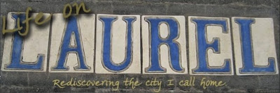
The other day my sister asked me to help her design and upload a customized blog header for her blog, Life on Laurel. She has been blogging for about 4 months now using Blogger and up until that time, she had only used a text header provided for the template she selected as her blog theme.

When she first asked me to help her do this, I asked her what she had in mind. She indicated that she wanted something with a street sign from Laurel Street as the main image. My first design was a good attempt, but it was neither symbolic nor meaningful.

So I searched through images and found one of a sidewalk with the word Laurel in decorative tile in the concrete. If you have never been to New Orleans, then you might not know that many of the streets feature their names in the sidewalks at the intersections. Anyway, I took the image and added the other text using Photoshop CS3. The whole process took only 30 minutes. The hardest part was trying to get the colors to match the theme of the blog template my sister selected.

This is the final version of the new blog header I created for
my sister’s blog. She asked me to help her design a customized
header the other day. 30 minutes later, I came up with this.


Once I finalized the design, adding it to her blog was easy. So, for those of you who want to know how to do customize your Blogger header using an image, here are the steps (shown for a Mac; PC steps may be slightly different):

  1. Log into your Blogger account
  2. Go to your Dashboard
  3. For the blog you want to customize, click the ‘Layout’ link
  4. In the Header box, click the ‘edit’ link
  5. Under Image, click the ‘Choose File’ button
  6. Browse to the image file you want to use and click ‘Choose’
  7. Under Placement, click the ‘Instead of title and description’ radio button
  8. Click ‘Save’
  9. Now you can click the ‘Preview’ button to see what your new header will look like
  10. Finally, click ‘Save’

That’s it... you’re done! Wasn’t that easy? There is one thing you should know before uploading an image though. The standard Blogger header width is reportedly 660 pixels. The idea being that if size your image to approximately this width, it will fill the entire header. When I did this, however, the image overlapped the header border on the right side. I could have selected the ‘Shrink to fit’ option when uploading the image, but I didn’t want to let the software determine how the image would look. Instead, I downsized the image to 650 pixels wide and re-uploaded it. When I did that, the image fell entirely within the border.

Why is this design so much more symbolic and meaningful? I’m glad you asked. The symbolism comes from a play on words. The title of the blog is Life on Laurel and if you look at the design, the words “Life on” are on the word “Laurel”, which is a play off of the title. Secondly, the words “Life on” only touch the first two letters “LA”, which is the abbreviation for Louisiana, because while the blog is about life in New Orleans, it is also about life as a Louisianian. The meaning comes from the fact that it is an image from Laurel Street and not something artificially created. So, the new design satisfies both characteristics very well.

The bottom line is customizing your blog is not that hard. In fact, it’s downright easy and it gives your blog an identity of its own, separating you from the crowd. According to Technorati, there are 112.8 million blogs. The even more amazing statistic is that there are 175,000 new blogs created everyday. So, you can see that adding a touch of customization to your blog might help to distinguish yours from the plethora of others.

Speaking of blogs, there are several others I follow. Most are from professional photographers and graphic designers, which I will blog about later, but some blogs I follow are from my friends. I would like to mention two in this post specifically. First, Piper Kinney Photography has a great blog where she shows off some of her recent work as well as discussed things that are going on in her life. She specializes in on location, natural light, children and family photography based in Humble, Texas. If you are looking for a very artistic and creative child photographer, check out Piper Kinney Photography. Second, Jackie’s Magic is a very interesting blog created by a very soulful and thoughtful person. Her posts are compelling and thought provoking. Interestingly enough, I designed Jackie's blog header as well. Both blogs should be added to your “Things I need to check out regularly” list.

Sunday, August 17, 2008

Dog Days of Summer

Tyson and I had some fun the other day playing around with my new strobes.
Tyson, a miniature pinscher, is often my model when I get a new piece of gear.


This is my dog, Tyson. He is a miniature pinscher and usually ends up being my model when I need to practice photographing something. This day, he was helping me test out my new strobes. I bought two Alien Bees B-400 flash units in a package the company calls the DigiBee. They are great because they are relatively inexpensive, very light and compact, and easy to set up and use. I bought them because I am doing more studio work now to compliment my natural light work. There’s a lot of creative freedom a photographer can explore when using artificial light solely or even when combined with natural light.

Speaking of photographing dogs and combining both artificial and natural light, I have been asked to photograph several hundred dogs later this fall in Austin for the Austin Dog Alliance’s “Cute Pooch Calendar”. They plan to have plenty of costumes and props for dogs and their owners to use, but participants can also bring their own. The idea is that the Austin Dog Alliance will choose the cutest pooch for each of the twelve months of the year and feature the best picture of that dog for their respective month. They plan to sell the calendars, with all of the proceeds going back to help the programs of the Austin Dog Alliance. The great thing about the calendar is that they will contain a coupon or two each month for local pet related products and services, so the cost of the calendar is virtually nothing. What a great deal!

I will blog more about this event as details become available. If you are interested, please check back here or contact the Austin Dog Alliance for more information.

Monday, July 7, 2008

July 4th in the Vieux Carre

I know I have been conspicuously absent from the blog lately. Sorry about that. With my final semester of school, my full-time job, and my side business going full speed, I seem to run out of time most days to throw together the words to create a post. But, I will do my best and hopefully I will be able to make it a more regular occurrence soon. Then again, my readership is only about 3 people, so I can probably get away with it, don’t you think?

Anyway, this past 4th of July weekend, I spent visiting my sister in New Orleans. She just moved back there after spending the last 9 years in Washington, D.C. We grew up in a suburb of New Orleans and we both consider that our home even though neither of us were born there. I hadn’t been back to the city myself for several years. Between my career, my wife’s career, and our other travels, New Orleans just got pushed to the back burner. It’s sad, but true. Even after Katrina, I wanted to go back and support the local economy, but I just never found the time or made the effort. Now that my sister lives there, however, things will be different. I plan to visit at least twice a year, if not more.

But that’s not what I wanted to blog about. What I wanted to share with you is my complete infatuation with city I call home, New Orleans (aka NOLA). I am so proud of my city. It is a resilient and determined city. Sure, its residents have been kicked around by nature, corrupt politicians, dirty cops, and criminals of all types, but it’s my city. It’s what I know and love. It’s who I am.

So after spending a few days there reconnecting with my roots, I remember now why I love New Orleans so much. It’s actually pretty simple. I love New Orleans because of the:
  1. Fascinating People
  2. Fresh Gulf Seafood
  3. Wonderful Music
  4. Amazing Architecture
  5. Interesting Art
  6. French Quarter
  7. Rich History
  8. Mississippi River
  9. Street Cars
  10. Superdome
  11. Saints
  12. Beignets
  13. Cafe Au Lait
  14. Fleur de Lis
  15. Street Performers
I could go on and on, but I won’t. I will leave some of the other wonderful things about New Orleans for you to figure out on your own. And these are in no particular order by any means. They are merely a stream of consciousness list of some of my favorite things.

There is nothing better than enjoying a freshly made muffuletta
from Central Grocery in the French Quarter along with a bag
of Zapp’s Spicy Cajun Crawtators and a creme soda.
That’s just what I did over the 4th of July weekend
and I loved every artery-clogging minute of it!


But if I had to pick my favorite thing from the list above, it would be the French Quarter, or Vieux Carre. I spent nearly two full days there this past extended weekend because I love it so much. I mean, I have been there hundreds of times. My family used to rent an apartment in the Quarter right off Decatur Street. But there is something about the French Quarter that I never get tired of. Maybe it’s the Cafe Au Lait and Beignets at Cafe du Monde. Or it might be the wonderful sights that clutter Jackson Square. Or it could be the amazing vendors at the French Market. Another possibility is the mouth-watering muffalettas at Central Grocery like the one featured in the picture above. But whatever it is, doesn’t really matter. What does matter is that New Orleans is a wonderful place. Whether you have been there before or not, it’s worth visiting. Not because the businesses need the revenue that is generated by tourism, and not because the city needs the taxes from that revenue, but because of all the reasons I mentioned here, and because you will love it... of that I am sure!

And as we say in New Orleans... Laissez Les Bon Temps Rouler!

Sunday, June 1, 2008

Social Networking

My normal Sunday morning routine is to get up early with the dog, fix coffee and breakfast, read the newspaper, and watch the morning news shows. I particularly like to watch ABC’s Good Morning America first, since it is on around the time I usually get up. Then I switch to CBS’s Sunday Morning when it starts, later in the morning. Well, today was no different, except that they both featured stories that by themselves are not that memorable, but when featured one after the other within an hour on two different networks covering different aspects of almost the same thing, it caught my attention.

If you didn’t happen to catch either of these programs this morning, I am sure you are confused by now. Let me explain. Good Morning America had a feature about the social networking site MySpace. But it wasn’t really about MySpace as much as it was about this ordinary middle-aged guy who worked at his local Home Depot as a credit manager. Outside of his regular job, however, he loved singing Boston songs. In fact, his daughter helped him create a MySpace page where she posted a lot of his remakes of Boston classics. The crazy thing was this guy is really good. I mean, when I wasn’t looking right at the television, I would have sworn the old Boston was back. Of course, it wasn’t the original singer, Brad Delp. In fact, Brad committed suicide in 2007 while on a tour break. But somehow, the remaining members of Boston found Tommy DiCarlo on the Internet through his MySpace page. After inviting him out for an audition, the band welcomed him as their newest member. Recently, Boston did a live show, Tommy’s debut, and it went very well. Who’s to say if this arrangement will last, but it definitely makes one think about the power of social networking.

As I said earlier though, this one story, as fascinating as is was by itself, was made much more powerful when about an hour later Sunday Morning featured a story about a Filipino man who was discovered much the same way. I’m sure most of you remember the band Journey from the 70’s and 80’s. What you may not remember is why the original lead singer, Steve Perry, was replaced. He suffered a hip injury while hiking and needed surgery to be able to continue touring. When he refused the surgery and stopped communicating with the rest of the band, they let him go. After several failed replacements, Journey recently stumbled upon Arnel Pineda from the Philippines. They found him through YouTube after watching several posts of him singing covers of Journey classics. Once again, the vocal resemblance to the original singer was uncanny. As with the previous instance, I don’t know if this new lead singer will be a long term solution, but he definitely honors the unique sound of the original band and that means he has a lot going for him.

The point of my rambling in this blog is the power of the Internet, the importance of social networking, and the total randomness of the world. I mean, here’s a great example of two guys who never could have dreamed that they would be the lead singers for two of the world’s greatest rock bands of all time, yet here they are. So the next time you post something on your MySpace page or upload something to YouTube, think about who might see, hear, or read it. Think about what you are saying about yourself and your friends. It could be your one shot at fame and fortune. If you don’t care enough to do it right, I am sure someone else in this world will.

Monday, May 26, 2008

A Memorable Memorial Day

So last week I decided that I wanted to do something historical this Memorial Day, while at the same time honoring those that have served our country and given the ultimate sacrifice. I had heard about a photography exhibit at the San Jacinto Museum and thought, what better way to spend this holiday than touring the site of one of the most famous battles in the War for Texas Independence and a World War I and World War II battleship, Battleship Texas; not to mention getting to see some great photography too.

The San Jacinto Monument stands 570 feet tall, which is 15 feet taller
than the Washington Monument in D.C. In fact, the San Jacinto Monument
is the tallest war memorial in the world. Wouldn’t you know that it
can be found in Texas. It’s located just east of Houston in the town of La Porte.

I wanted to get there early because I knew that it would get crowded later in the day... oh yeah, and much hotter! But I wanted to take some pictures of the site while I was learning about the battle and the brave men who fought on this sacred ground. Arriving at the park at around 9:30 a.m., I was able to get quite a few good shots of the monument and the surrounding areas without a lot of other people in the image. Of course, having one or two people in your image, even if you don’t know them can be a good thing when you are photographing something like a tall monument. That is because it helps to give the tall subject in your image a sense of proportion.

Anyway, I started my educational experience by touring the battle ground. There were several markers around that described various parts of the battle. It was very interesting to follow how the battle progressed on the actual ground as opposed to just reading about it or watching it at the little movie theater inside the main building.

After that, I took some time looking at and reading about Cecil Thompson’s historical photographs of Houston. This was, after all, the original reason I started thinking about going to the San Jacinto Museum in the first place. The exhibit was extremely interesting. Being a photographer myself, I admire the early pioneers and marvel at the images they were able to produce with such primitive equipment.

Finally, I concluded the day with a tour of the Battleship Texas. This was a wonderful reminder of how our Navy sailors and Marines live, work, and fight every day. It takes a special person to do that for any period of time, let alone an entire career. I served in the Army for four years, but was never deployed overseas. I am truly thankful that there are brave men and women that are willing to put themselves in harm’s way for the rest of us so that we can continue to live in comfort.

Well, that’s it for this week. If you are ever in the Houston area and want something fun and interesting to do, definitely consider visiting the San Jacinto Museum. I don’ think you will be disappointed.

Sunday, May 18, 2008

Finally... Some Time to Relax

Well, I’ve been a little quiet lately as you may have noticed. I have a good excuse though. I am one semester from obtaining my MBA and for two of the last three weeks I have been studying for finals and completing all my required assignments. This, along with work, kept me extremely busy as you might imagine. And this past week, my wife took a short trip to Florida. It was nice to finally get some time to relax for a few days.

Siesta Key Beach (near Sarasota) has some of the whitest sand of any U.S. beach.
This photo was not altered. The sand is very fine, which makes it super soft.
Also, because it is so white, the sand is not hot, which makes it much nicer
for walking around in your bare feet.

We actually stayed at the
Hilton on Longboat Key, which is just a few islands north of Siesta Key Beach, but it is one of the only major name hotels on the islands and we had HiltonHonors points to use anyway, so that is why we chose to stay there. It was right on the beach and only 10 minutes from St. Armands Circle, where we spent every evening eating, shopping, enjoying ice cream, and people watching. If you are ever in the area, make it a point to stop by Lido Key and walk around the circle. If you are hungry, you have to eat at the Columbia Restaurant and get ice cream at Kilwin’s. They are both excellent!

What I actually want to talk about in this blog post though is packing photography gear for a trip like this. Since this was intended to be a fun and relaxing vacation, I decided not to bring a lot of my professional gear. Instead I simply brought my Nikon D50 with my all-purpose Nikon 18-200 mm VR lens. I also brought my Nikon 10.5 mm Fisheye lens and my SB-400 flash, just in case, as well as a bean bag for resting my camera for long exposure shots. Other than that, I brought six 1 GB memory cards and my 12-inch PowerBook for storing my images.

That was the extent of my gear and I was able to get a lot of good shots. Sometimes photographers can go overboard when packing for trips. They tend to bring more gear than they need and end up lugging it around all over the place, without ever pulling it out of the bag. When I am packing, I make a promise to myself that if I put a piece of gear in my bag, I will use it. For this trip I did pretty good. I used everything except the SB-400, but that was a “just in case” item anyway.

So, the next time you go on a trip, pack only what you will use. Remember, it isn’t the gear that makes the photograph, it’s the photographer. If you want to see the photographs I took while on vacation, you can check out my flickr photostream. Enjoy!